
Dongpeng Beverage is a popular national drink in China, with a wide distribution mainly targeting young people in lower-tier markets. As a cocktail becomes a hedonic consumer product for today's youth, emerging in various parties and refined gatherings, we need to match the product's tone with young consumers, ideally creating an unexpected sense of surprise. In any era, the first thing that catches the memory is visual graphic symbols. Looking at those successful global brands, it is not hard to find their commonality - high degree of symbolism, where a brand is a label.
The main purpose of the design is to help the brand establish a visual impact through symbolic visual graphics and facilitate the extension of other series of brand products.
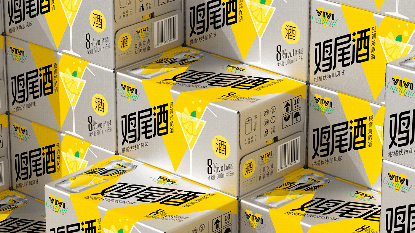
Adopting a minimalist aesthetic style, starting from the product name Dongpeng VIVI Cocktail, we custom-make the visual hammer "V", forming an easily recognizable symbol from a great distance. Using flat, spectrum-style color blocks to summarize the cocktail graphics, we build an instantly recognizable category perception, reducing the cognitive cost for consumers.
Adopting a minimalist aesthetic style, starting from the product name Dongpeng VIVI Cocktail, we custom-make the visual hammer "V", forming an easily recognizable symbol from a great distance. Using flat, spectrum-style color blocks to summarize the cocktail graphics, we build an instantly recognizable category perception, reducing the cognitive cost for consumers.


Please feel free to contact me through the following links.
-
-
ins: tigerpan_panhu
facebook: Tiger Pan
pinterest: TigerPan潘虎

